Brooklyn, New York
DESIGN TEAM:
Davis & Davis
PHOTO CREDIT:
© Hampshire
Before it evolved into what it is today, the owners of Smart Space, Hampshire Properties, had a co-working office space problem. “It was lacking in the area, because rent space was so high,” says architect Howard Davis.
Recognizing this issue, the company came up with the idea of transforming its property into a shared co-working facility, especially since the space adjacent to them was available and located in a place perfect for drawing people in. “They offer space for every budget: single seats, or small to large offices.”
The latter, says Davis, is determined by flexible partition walls that expand or divide space based on demand. “The idea was to create a unique, current environment that encompasses a variety of needs from the community, and be a hub of activity in the area,” says Davis.
His wife and partner, Michelle, came up with a design that has allowed the property to become a local destination spot. Her work contrives universally accepted colors, clean lines, local art and an interesting materials palette to suggest an industrial feel that pays homage to the location. “There was a long list of requirements that they hoped to be able to house within the space,” recalls Michelle. “As we progressed, it altered slightly to achieve a higher density.”
Davis aligned a variety of productivity zones and several other spaces with the desired capacity. Although some of the office square footage shrank, the shared amenities of offices are increasingly important, she notes. “The mentality of having less private space per individual has really reached the baseline. But then the resurgence of more public space and collaborative spaces and more shared amenities gives everybody the space in which to really work together, collaborate and share stories in these environments, and then go back to their smaller footprints.”
Davis’ design for the space is really a nexus of a productive work life and a comfortable home-like space. “It’s a living office,” she says.
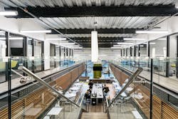
The large space’s acoustics are a multi-dimensional force that had to be accounted for in the architecture and interiors. In the core and shell, the sounds of mechanical systems, power and building vibrations, are dampened with insulation, underlayment and drywall. Inside, was a different story, especially considering the expanded mezzanine, which completes the atrium-like feel, and allows for perimeter offices, explains Michelle Davis, co-founder of Davis & Davis, and senior designer on the project. Room acoustics, which are often affected by the geometry of the space, as well as equipment and accessories in the space—which can introduce a second layer of sound—was addressed via material choices for the walls, ceiling, floor and furniture surfaces.
One example is in the mezzanine, where horizontal wood slats provide a textured vs. flat surface, helping disperse sound. The sound that hits the slats, hits the face, or goes between them, dampening impact. Visually, the horizontal nature, in concert with the balcony element, contrast and make the slats stand out even more because of the angular shape.


