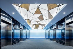
Three-Dimensional Design Creates Lobby Focal Point
Montreal, Canada
DESIGN TEAM:
Group Marchande Architecture Design (GMAD), Montreal, Canada
The renovation of the elevator lobby inside the 1010 Sherbrooke West office building in downtown Montreal was long overdue. The dimly lit lobby had a cavernous feel and included outdated features such as the half-barrel shaped ceiling that dominated the 700-sq.-ft. space.
“Our goal was to add pattern and shape to the ceiling with the necessary lighting for it to become a beautiful focal point,” says Andre Dimitrovas, senior interior designer at Groupe Marchande Architecture Design (GMAD) of Montreal.
INFLUENCE:The vision gmad had for the ceiling was that of a three-dimensional geodesic dome with different size triangular-shaped panels arranged asymmetrically at various angles throughout the ceiling. “We wanted some of the panels to be wood slats and some of them to be flat and white,” says Dimitrovas.
To make the ceiling concept a reality, gmad turned to the You Inspire Solutions Center at Armstrong to come up with a model that would enable the ceiling to be built.
SOLUTION:While the original concept called for each panel to be unique in size and shape, the You Inspire Solutions Center developed a 3-D model that achieved the design intent using a combination of common and one-off panels from the Armstrong family of custom WoodWorks ceiling systems.
The 72 triangular-shaped panels, which include an array of wood grille and white solid wood panels, are attached at various angles to a custom layout of the Armstrong Drywall Grid System, using angle brackets to create the different angles in the grid. “The grid pattern was the key to everything,” says You Inspire Solution Center design engineer Michael Tongel. “The layout of the grid dictates the angles of the panels, and the angles of the panels create the undulating visual in the ceiling.”
Using a standard drywall grid system, Tongel created the unique shape needed to support the panels at various angles. “I have never seen our drywall grid system used in a shape like this before, but it just seemed to make sense,” he says. “It gives you a wider flange at the bottom and it’s able to support more weight.”
Included in the grid pattern are spaces for the linear lighting that sits in the 2-in. reveal between the panels and the space for the light cove that surrounds the perimeter of the ceiling where it meets the gypsum bulkhead. By making the 12-ft. × 30-ft. ceiling more symmetrical and finding ways to repeat panel patterns wherever possible, the design team effectively recreated the same high-impact visual with fewer custom panels, reducing the cost and making the ceiling easier to manufacture and install.
“With all the acute angles, we were able to create the same dynamic shape with between 12 to 15 different panel sizes,” says Dimitrovas. “We didn’t want to venture into something that was totally customized, so having Armstrong’s engineers on board gave us the confidence that we could build the ceiling and do it in a budget-friendly way.”
null