Cincinnati, Ohio
DESIGN TEAM:
GBBN
CHALLENGE:
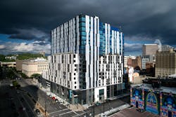
In an iconic hit song, paradise was paved and turned into a parking lot. In Cincinnati, a parking lot was torn up and turned into – well, maybe not paradise, but a handsome new building. Dubbed 1010 On the Rhine, the mixed-use structure opened in the fall of 2019, with classical skyscraper massing that helps it fit into the surrounding historic district, and a unique metal panel and glass façade that makes sure it stands out in the city’s skyline.
The project spent several years in development, says Steve Kenat, AIA, principal and director of community development with GBBN, Cincinnati. Property owner Rookwood Properties wanted to develop with Cincinnati-based Kroger supermarkets. Cincinnati Center City Development Corp. helped them to incorporate a two-story, flagship store. “The vision was to transform this knuckle – it’s right in the middle of the 2-mile loop that is our streetcar line,” Kenat says. “It’s a great in-between” to join the Downtown and Over the Rhine neighborhoods.
INFLUENCE:
“The massing and articulation – almost all of it was driven by the historic context,” says Stefan Cornelis, a GBBN associate on the project. “But we still wanted it to be a contemporary building.”
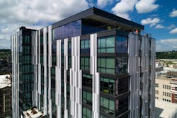
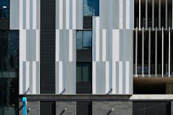
A large part of the building’s modern-day flair comes in the combination of metal wall panels and glazing used for the exterior. Precast cement panels in two shades of gray define the parking decks, and the remainder of the building that’s not glass is clad in vertically installed metal panels in four colors to create a vaguely art deco-ish pattern. “We ran computer algorithms so that it’s not random, but it seems like it has an organic feeling to it,” Kenat says. The process, according to his colleague Cornelis was “really, trial and error – is there enough variation? Is there enough of the reflection coming out?
SOLUTION:
“To supply the panels, GBBN and installation contractor KRSM from Wheeling, West. Virg., turned to Petersen. Approximately 44,000 sq. ft. of the company’s Flush Panels were specified in .040-gauge aluminum, split between finishes of Stone White, Cityscape, Silver and a custom Charcoal. The company also provided important design assistance as the project progressed.
“We worked through detailing with a rep coming in to work through each condition,” Cornelis says. “The jamb detail was very important to us, and how to transition at the shifts every other floor – we actually drew them in 3D.”
The project opened with a big celebration in Kroger’s one-of-a-kind food hall, which immediately became a popular destination spot with the local foodie crowd. And leasing proceeded at a rapid clip for the stylish apartment residences, as well.
“Everybody was adamant that this project needed to bring a vibrancy to the area and that this building would be a tipping point,” Cornelis says, noting that that goal seems to have been met. “It has generated more development, more rehabs, and more reconversions of buildings on Court Street to residential buildings. “


