Kent, Ohio
DESIGN TEAM:
Weiss/Manfredi
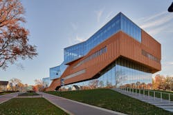
On the campus side, light-colored brick, along with concrete, predominates, drawing on the limestone shades of the school’s oldest structures. The town side, however, features brick in deep red tones. For this building, New York City-based Weiss/Manfredi brought those downtown hues onto campus, combining millennia-old masonry technology with cutting-edge architecture to create a high-performance structure that’s also become a teaching tool.
Aiming for LEED Platinum certification, Weiss/Manfredi’s architects selected brick that was produced locally. And they got their own lessons in how brick is fired and in how its color can shift based on how it’s produced from supplier Belden Brick.
“We focused our studies on a bee-hive firing process, where the location of bricks within the hive and heat source effect the amount of heat that the brick absorbs and, in turn, the brick’s color,” says David Maple, Weiss/Manfredi’s project architect on the job. For the horizontal runs, designers chose a narrow, Norman-style brick that’s iron-spotted. A custom bullnose brick also was developed to create vertical “fins” for added depth and shadowing across the façade. “The orientation of the fin and the depth of the fin were all studied and designed to optimize the site conditions.”
The fins, which project a maximum of 4 in. from the building plane, are spaced to coordinate with control joints and required weeps in the brick façade. Each succeeding floor’s fins are offset slightly to give a sense of scale and movement, drawing eyes upward to the 650-seat “design loft” that tops the structure. The custom die Belden created to manufacture the fins now is on display in the building.
One of the more striking aspects of the building is the way the brick appears to be suspended over the lower-level curtainwall. Maple says this suspension is, effectively, a rainscreen construction, with brick as the outside cladding. The illusion of suspension is created by a backup wall attached to posts hanging from the slab above. Ensuring successful installation required significant attention to design details, Maple says.
“All the window frames, control joints and weep locations were considered with the brick pattern to conceal these items within the layout,” he says. “Due to the angles on the project, every mortar joint and brick was drawn for layout coordination.”
The architects see this unique façade treatment as a case study for the center’s students in ways this ancient building material remains relevant in even the most modern-day settings. Maple says it has also become a tool to help students visualize the way building materials come together—and the importance of clear visual plans to ensure that effort is successful.
“With this project being a school for architectural design, and with the university’s desire to make the project a tool for learning, we thought utilizing the brick in an atypical way and suspending it—though the bricks still rest on a shelf angle—could allow the students to understand the detailing of the system.”


