Q+A with Hans Papke
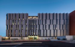
One look at the new Pinal County Attorney's Office in Florence, Ariz., and it's clear that this building was designed with out-of-the-box thinking. Architectural Products wanted to know what inspired the unique façade and how DLR Group seemed to have achieved the impossible with a constrained budget. Their Senior Associate, Architect Hans Papke indulged us with a detailed explanation of the design and how it came to be.
What were the design objectives for this project?
We do a VALUES (Viewing Architecture through the Lens of User Experience and Sustainability) and visioning session with the end user to dive into what their wants and needs are for the project. This is typically a one- to two-day process. For this project, some of the leading principles were:
1) The building needed to be located next to the Superior Court in Florence, Ariz.
2) The architecture needed to relate to the type of work that was happening within the building; the design should reflect authority and empowerment.
3) There needed to be a connection to the public since these are public officials and show that they are one family—that they are there for the community.
4) The architecture needed to be modern and completely different from the court building, and the building should be forward-thinking and attractive.
5) They also wanted to attract the best and brightest employees from around the state and other states.
How was biomimicry applied to this project?
On the drive from Phoenix to Florence, you go through about 30 minutes of desolate landscape with no buildings, just open desert. I went out into the desert one day, trying to pull some inspiration. The saguaro cactus has always been an intriguing thing for me because this is one of the only areas in the world where they grow.
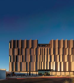
The ribs of the saguaro cactus are self-shading elements; no part of the cactus receives direct sunlight for more than 15 or 20 minutes, which allows that plant to thrive in the desert. That became my inspiration to develop a self-shading building and reduce the solar heat gain and energy costs, so the county and the taxpayers aren’t wasting money on a five-story building that’s a heat sink.
For buildings in the desert, you typically want the longer parts of the building to face north and south so you want your building to be rectilinear, east to west. That provides a south facade of the building that’s going to receive a lot of sunlight all day long. The thought was, “How can we take that facade, put windows in it, and not get direct sunlight into these offices to heat them up?”
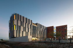
So every place we have a slotted window on the south side, there’s a fin that shades the window so that it doesn’t really receive any direct sunlight after 12:00 PM every day. And at 1:00 PM, it starts to cast shadows beyond the window, which helped shade other parts of the building as well. We did a lot of studies on where to put the shade fins, how much shade they cast on the building, and we went with a design that casts around 56% shade on the building. We worked with our structural engineers really closely and created a custom design detailing one fin, and then used that same detail for the 120 fins that we have.
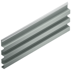
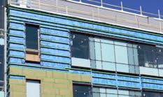
We also found ribbed metal panels that were off the shelf, and we used them on the facade as well to create little pockets of shade. It wasn’t just the shade fins that were casting shadows on the building. The vertical ribbed metal panels were also casting smaller shadows on the building. We were able to take a rainscreen system and pull it off the building two inches to allow heat that got behind the metal panel to escape out like a vertical chimney without allowing it to go into the exterior wall system. These structural elements create a whole self-shading, heat-reducing exterior facade.
How were the other facades treated?
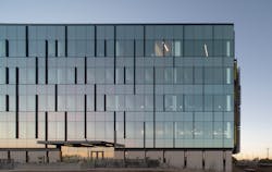
The north side of buildings here get a lot of indirect sunlight, which allows light to penetrate into the building and not get the direct solar heat gain, but we used a Solarban 90 glazing that also helps.
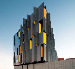
On the south facade of the building, we wanted to use copper-colored panels, but due to the cost, we couldn’t. Instead, we have a custom color-changing metallic paint on the panels that, as the sun moves across it during different times of the day and different seasons, changes colors from a bronzy copper to a darker patinaed metal color.
On the west façade, we used a perforated metal panel and put glass behind it so little portions of light bleed through the panel to come into the building. The screen helps to manage the harsh sunlight the west side receives for three to four hours each day. It had some of the best views, so we wanted glass there, but we needed to be able to reduce the heat on the building. We implemented pops of color from the yellow saguaro cactus flower and orange barrel cactus flower with these internal fins that we developed.
The fins worked. They created estimated energy savings of 22% in rooms on the south side of the building on a typical June summer day. Solar heat gain was reduced by 14% in rooms on the west end of the building.
What was the impact of the tight budget on this project?
We have a workplace group within DLR Group, and we consulted with them a lot. They were saying that a typical five-story office building would cost around $375 per square foot. Our budget at the time was $250 per square foot. We sat down as an integrated design team and looked at how we could reduce space within the building.
We first looked at the non-occupied spaces like the plenum space and mechanical and electrical room. When we first started working with the mechanical engineer on this project, I asked him, “What percentage of space do you need for your mechanical rooms and equipment space?” They gave me a number between 6% to 8% of the building's square footage, which equated to three-quarters of the space on the first floor just for mechanical. There was no way we could accommodate that.
Typically, mechanical engineers and electrical engineers do the majority of their design during our construction document phase. I asked them to take their budget from that part of the phase and move it up earlier to the design development phase. They thought I was crazy, but I said, “If you can tell me the exact size of your equipment and how it can be situated, I can shrink these rooms down to the bare code minimum so then we can have more occupiable space for break rooms, offices, and conference rooms.” During construction, the mechanical contractor and electrical contractor built 3-D models of the space down to half an inch to make sure we had all the correct clearances for everything. It’s kind of like building a Swiss watch. It’s one of the tightest mechanical electrical rooms I’ve ever seen, but it’s completely functional and there’s no wasted space.
We took some of the offices and tightened those up to the bare minimum county-required office size. The moment you start to look at building codes and clearances for those offices, they start to grow because you’ve got to meet minimum requirements. We also had the challenge to bring natural daylight into the building so the offices have all glass fronts into the corridors so the light from the exterior could go through the office into the interior corridors. And then instead of using swing doors, we used glass sliding barn doors. That helped us shrink the space by about 15 sq. ft. per office.
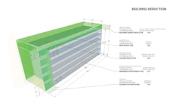
We were able to reduce the building square footage from 60,000 sq. ft. down to 55,000. We reduced the height of the building by 14%. We reduced the building skin by 18% and the building volume in total by 22%. It takes a great deal of special engineering to do this. These reductions got us closer to the budget.
